 You probably miss our weekly blogs as much as we do. But now that we’re in the middle of what is often thought of as the darkest winter month we thought it would be good to bring some extra added colour into our lives. Easier said than done when our project is dedicated to monochrome salted paper which are not known as the most colourful of photographic processes ever invented.
However, as this week’s guest author will show, the Victorian age was perhaps not as dull as we might think. As well as being one of our valued project research affiliates, Janine Freeston is also an authority on colour photography and has chosen an often overlooked, or little-known aspect of Talbot’s oeuvre: the coloured salted paper print.
Brian Liddy
![]()
 Guest post by Janine Freeston
I was recently reminded of the variation in colour of Talbot’s photographic prints by a previous blog post by Professor Schaaf.
The blue colour in the daguerreotype by Mike Robinson of Henry’s grave showed that variations in colour are not constrained to monochrome photographs. A myriad of tones and colours can be clearly seen across any series of prints from the same negative throughout the Talbot Catalogue Raisonné, some of which are quite surprising. Those differences in colour and tone can reflect deliberate experimentation or be due to unforeseen influences from differences in chemicals, water, paper or temperature, to light and time. This could be both in the making of the prints and in their ‘life’ afterwards. The colours and their legibility range from fugitive ghostly whites to strong, fixed, velvet browns and blacks, all in a monochromatic spectrum.

In 1839 Talbot noted his astonishment at the range of tonal effects in his photographic experiments. He extended his range of colours by mounting the thin salted paper prints on coloured background materials. By “merely varying the proportions and some trifling details of manipulation” he claimed he could attain colours such as “Sky-blue, Brown, of various shades, Yellow, Black, [and] Rose colour.” But for some reason, not green!
So, the desire for colour photography is as old as the term itself, but whether in salted paper prints, calotype negatives or daguerreotypes, true colour was unattainable in photography’s early days. But Talbot was right when he suggested that the camera had the potential to register a greater range of the solar spectrum than the human eye can see, a fact which almost one-hundred and eighty years later can be potentially utilised to reveal more within his now faded works. Despite valiant compromises, twentieth century trichromatic photography relied upon chemical discoveries and viable technological solutions that would take decades to understand and even more decades to resolve. Consequently, in the 1840s compromises were sought to approximate colour for artistic effects.
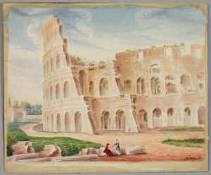
John Werge’s anecdotal ‘Evolution of Photography,’ sheds some light on the difficulties that arose in the application of coloured pigments to monochrome photographs by hand. He recalls that in 1854 when he was working as a professional daguerreotypist and colourist of daguerreotypes, he was offered a job in London (in an establishment nearby to the business of Talbot’s one-time assistant, Henneman) to colour salt paper prints. Werge turned the job down as he admitted being unable to work with the “totally different” paper-based process. The art of painting on a metal daguerreotype required precision and delicacy as the pigment sat on the surface of the fragile image, while the salted paper print chemically and structurally undermined the application of pigment by absorbing it into the randomly structured fibres of the paper. Whether brushed on dry, or as a liquid, the resultant fuzzy edges to the colour is highly reminiscent of water-colour painting, as demonstrated in examples held in the Talbot Collection of the British Library.
Each of these hand-painted prints has the same light brush stroke and on close inspection they show little or no visible evidence of photographic chemical residue. Whether washed away during painting or extremely underexposed, each painted print appears more painterly than photographic.
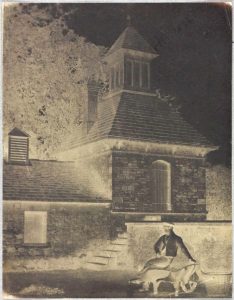
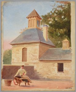
When ‘Dove Cote, Singleton’ is juxtaposed with its waxed paper negative, it reveals how underexposed the painted-over print had to be. The translucent pigment in the red waistcoat shows no sign of the dark shadow that should be evident in a fully exposed photographic print. Instead, the shadows are created through layers of colours in large brush strokes, and more graphic details are maintained by controlled finer brushwork.
The technique of rendering an underexposed print exemplified in the painted, ‘Northumberland House from Trafalgar Square, London’, which uses very pale translucent colours where the details of the fencing in front of the house (evident in other prints) fall away, and yet the window details remain.

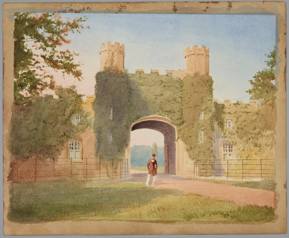
The artist may have required a fully exposed print to ‘read’ the details lost in the print they were painting. In ‘A man at the gateway to a country estate’, the artist’s skills in rendering fine lines shows.
The provenance of these painted prints is irrefutable, as is their rarity. Arguably they are more likely to be mistaken for an accomplished watercolour than a hand-coloured photograph. Subsequently, the mis-identification of such works over a century may have obscured many experiments in early colour photography.
Janine Freeston

• Questions or Comments? Please contact digitalsupport@bodleian.ox.ac.uk • A mosaic of plates from, The Pencil of Nature, ‘XVIII. Gate of Christchurch’ (fascicle 4, 21 June 1845), Schaaf number 913. To illustrate the variety of tones and hues to be found across multiple prints from the same negative. • Hope Kingsley, Crosscurrents of Aesthetics and Technology in Nineteenth Century British Photography, Courtauld Institute of Art, University of London, 2001, Chapter 3. • William Henry Fox Talbot, Some Account of the Art of Photogenic Drawing: Or the Process by Which Natural Objects May Be Made to Delineate Themselves without the Aid of the Artist’s Pencil, Printed by R. & J. E. Taylor, Red Lion Court, Fleet Street, London, 1839. • Calvert Richard Jones, ‘67. Colosseum, Rome, 2nd view’, 1846, hand-coloured salted paper print, courtesy of the British Library, Talbot Photo 3(81), Schaaf 3130. • Calvert Richard Jones, ‘160. Dove Cote, Singleton’, 1846, hand-coloured salted paper print, courtesy of the British Library, Talbot Photo 3(79), Schaaf 3205. • WHFT, ‘Northumberland House from Trafalgar Square, London’, date not known, hand-coloured salted paper print, courtesy of the British Library, Talbot Photo 3(78), Schaaf 1201. • WHFT, ‘A man at the gateway to a country estate’, date not known, hand-coloured salted paper print, courtesy of the British Library, Talbot Photo 3(80), Schaaf 1305. • For more information on Talbot’s coloured salted paper prints, see Professor Schaaf’s project blog which references a fine example of a waxed coloured print intended for viewing by transmitted light in a peep-box. • For other examples of hand coloured prints see Schaaf numbers 1933, 2189, 2736, and 3774.