
Since Halloween tomorrow is my good friend and colleague Roger Taylor’s birthday, it seemed like an auspicious time to celebrate by turning to one of Talbot’s spookiest images. It is a marvel, but I have never understood the precise origins of its spectacular colour.

A Forbidding Stand of Winter Trees
Seemingly sprouting up from the Nether Regions, the spindly branches of a lime tree reach out of a fiery environment. Talbot has placed his camera very low, looking up, making the tree all the more majestic and threatening. Winter’s cold has stripped all the trees of their leaves, laying bare skeletal structures ideal for study by artists or even ourselves. This extraordinary print seems to record an intensely heated world – indeed, it is the hottest Talbot print that I have ever seen. Or shall we take a more benign view of it, the autumnal leaves imparting their colour to the sky?
At this stage, we don’t know for certain what chemical or manipulative peculiarities led to this print. I’ve known it for a fairly long time and it has not changed colour perceptibly within that period, but is it the same colour that Talbot saw perhaps 175 years ago? My guess is that it dates from the winter of 1839/1840, when Talbot was beginning to get a handle on his photogenic drawing negative process. It could possibly date to 1841 or 1842, when he was photographing nude trees but generally with more traditional results.
By 1844 when he was facing the production demands of The Pencil of Nature, Talbot found that the variables of weather and chemistry forced him to accept a range of colors in his prints. He observed that “as far as respects the design, the copies are almost facsimiles of each other” but then went on to explain that “there is some variety in the tint which they present. This arises from a twofold cause. In the first place, each picture is separately formed by the light of the sun, and in our climate the strength of the sun’s rays is exceedingly variable even in serene weather. When clouds intervene, a longer time is of course allowed for the impression of a picture, but it is not possible to reduce this to a matter of strict and accurate calculation. The other cause is the variable quality of the paper employed, even when furnished by the same manufacturers – some differences in the fabrication and the sizing of the paper, known only to themselves, and perhaps secrets of the trade, have a considerable influence on the tone of colour which the picture ultimately assumes. These tints, however, might undoubtedly be brought nearer to uniformity, if any great advantage appeared likely to result: but, several persons of taste having been consulted on the point, viz. which tint on the whole deserved a preference, it was found that their opinions offered nothing approaching to unanimity, and therefore, as the process presents us spontaneously with a variety of shades of colour, it was thought best to admit whichever appeared pleasing to the eye, without aiming at a uniformity which is hardly obtainable.”
Rather than “pleasing to the eye,” I suspect that most viewers will see this colour as unsettling, challenging, intriguing, but in any case appropriate to the season.
While Bill Hillman’s tree is unique in its visual power, there are other Talbot photographs that reveal various intensities of red. This seems to occur most often and most dramatically in negatives. Did it result from rapid overexposure of a very bright area, such as might have been behind the lime tree, or that would have reached the paper directly in this series of photograms? None of them are dated and none carry any special notations, so the analytical work of the conservators is cut out for them.

The idea that overexposure – solarization – might be the key to the formation of these reds is an appealing one. This negative has always puzzled me, for there is a certain confidence about its execution, yet the camera is not properly leveled and the application of the chemistry was obviously done with some hasty enthusiasm. Lacock Abbey’s clock helpfully reveals that this was exposed at eight in the morning with the trees in the full leaf of summer, so the sun might well have been very bright.

We’ll finish here harkening back to the last two blogs, which explored Talbot’s 1845 publication of Sun Pictures in Scotland. The photographs for the book were all made in one trip in October 1844, a time of the year when Scotland’s weather can seem brilliant but the actual intensity of the sunlight is not great. Above is a radically different and more conventional way at looking at Doune Castle than that of the lead photograph in last week’s A wee while in Scotland. This negative has been waxed and betrays some evidence of rough handling, but was probably close to this colour to begin with. Older readers who have worked in wet darkrooms might remember employing staining film developers such as pyro that exploited the blue sensitivity of photographic paper. Talbot’s printing paper reacted only to blue light, so the reds of this negative would have appeared intensely dark to the paper, leading to a higher contrast. That might have come closer to Talbot’s remembrance of the occasional sunny hour during his northern adventure.
Larry J Schaaf

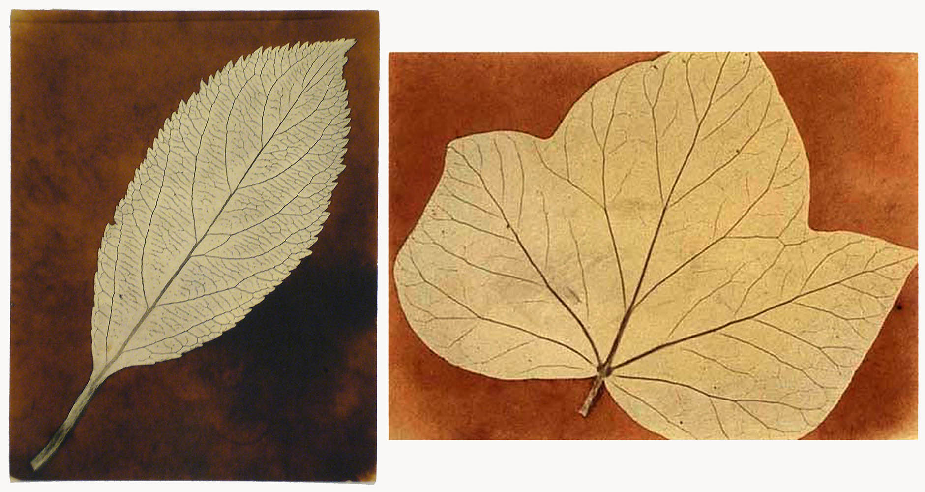
• Questions or Comments? Please contact digitalsupport@bodleian.ox.ac.uk • WHFT, A Forbidding Stand of Winter Trees, salt print from a paper negative, likely winter 1839/1840, William T. Hillman Collection; Schaaf 3828. The negative for this is not known to have survived, but there is one other print, in very faded condition and made later after the negative was further trimmed; formerly André Jammes Collection, Harrison Horblit Collection, the Houghton Library, Harvard University., TypPr805.T820.111. • WHFT, “Introductory Remarks,” The Pencil of Nature (London: Longman, Brown, Green, & Longmans, 1844). • (left) WHFT, Single Leaf, photogenic drawing negative, National Media Museum, Bradford, 1937-2002, Schaaf 1686; (right) WHFT, Solitary Leaf, photogenic drawing negative, Thomas Walther Collection, courtesy of Hans P Kraus, Jr, Inc, 301451.738, Schaaf 4268. • WHFT, The Clock Tower at Lacock Abbey, calotype negative, National Media Museum, Bradford, 1937-2675, Schaaf 1732. • WHFT, Doune Castle, Scotland, calotype negative, October 1844, National Media Museum, Bradford, 1937-4030, Schaaf 2040.